
 I've been taking a break from my blog but finding other distractions. For about the past year, my blog has been having an existential crisis. I'm sorting through what exactly I want to do with my blog in 2011, so look for a post very soon. If you want to put a plug in for your own preferences, now is the time.
Thursday, December 30, 2010
Where is Take Out Photo going in 2011?
I've been taking a break from my blog but finding other distractions. For about the past year, my blog has been having an existential crisis. I'm sorting through what exactly I want to do with my blog in 2011, so look for a post very soon. If you want to put a plug in for your own preferences, now is the time.
Monday, December 20, 2010
Night as white space
 "Motel MO" from my State Street project
So many photographers have inherited the zone-system anxiety about what constitutes "good" exposure that they begin to treat every photograph as if it were meant to be an Ansel Adams landscape. "Blown-out" highlights are evil! Details in the shadows are good! Have you heard that type of talk? Do you hear it in your head when you look at your own work? If so, it might be time to consider the graphic qualities of photography as opposed to its painterly qualities.
If I were to declare one absolute here, it would be that when people say there is only one right way to make art they are absolutely wrong. If you want to take hauntingly beautiful photos with seamlessly nuanced tones à la Michael Kenna —and who wouldn't? I adore Kenna—then you will definitely want to avoid blown out highlights or darkness with no detail. But if you want to try something more akin to graphic design, you might want to embrace darkness (that's right, come to the dark side!) as a design element: white space.
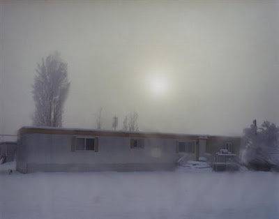
 Another "Motel MO" shot with even more "white space"
An excellent little post about white space in graphic design explains that "white space does not hold content [...] and yet it gives meaning, through context, to both image and text." In its original printing press context, white space represents extravagance, luxury, or squandered space, depending on your attitude. If your top priority is cramming as much information on a page as possible due to the per-page cost of a publication, then white space is just a lost opportunity. If, on the other hand, you want to convey simplicity and elegance, then white space does the talking for you. A corollary in wedding album design is that the most timeless and elegant albums tend to have the fewest photos. But when you think about it, the aesthetic is grounded in economic realities of mass produced printing. Keith Robertson's post notes that clutter has come to represent the working class and that white space is associated with the upper class. "So," he posits, "the quality aesthetic has been hijacked by bourgeois ideology..." Fascinating. When was the last time you thought about the ideological implications of design?
 "Copper Vu" from my State Street project
It all comes down to your frame of reference (I highly recommend the book Predictably Irrational for many examples of how the frame of reference guides our thinking) Imagine, for example, a painting, a very painterly photograph, and a photograph that looks like something you might see in a newspaper. In that context, people would be more likely to value the painterly photograph as superior. In other words, if tradition has encouraged us to value painting over graphic design, and if we subconsciously assess a photograph in that context, we will may end up thinking that pure black and stark white are inferior to subtle gradients.
I could go on and on, but instead, I will encourage you to think about white space in night photography. Personally, I have a much easier time embracing a black night sky than accepting a blown-out white sky. When I look at a photo like this one, however, I realize that I should play around more with completely white white space in photography.
If you are working on night photography this month, see what happens when you embrace the dark as a design element rather than fear it as a flaw.
Thursday, December 16, 2010
On my coffee table: Todd Hido's A Road Divided

The photo doesn't do justice to this gorgeous oversized book. In the future, I'll take my own photo of the book cover, but I didn't want to keep putting off this post. I received this book as a birthday present (I'm loving the Amazon.com wish list feature!) and it is even better than I had imagined.
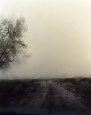 image from the book via flavorwire
Nazraeli Press is responsible for the the gorgeous quality of the printing. When I shop for photo books, the publisher plays a large role in my decision to buy. Obviously, the photographer is the main factor, but if the book is with Steidl, Twin Palms/Twelvetrees, or Nazraeli, then I am more likely to prioritize it. I envy the reviewers who get free copies in the mail. Somebody hook me up with that job.
In any case, this post certainly won't be a good audition for a job as a reviewer. My point here is share what's out there by looking at the books that make their way to the hallowed space of the man-cave concrete coffee table.
 Todd Hido first made it onto my radar when I saw a copy of his book House Hunting at the Centre Pompidou bookstore. Would that I had bought it then when it was only $75! Now it will cost me at least $169 if I finally break down and get a copy.
 A page of A Road Divided (and somebody's finger!) via Bookofdays.
Many (if not most) of the photos in this book were taken through the windshield of his car, often through rain, fog, or ice. The images convey the kind of beautiful melancholy that American culture usually avoids. The French, however, savor the feeling. All the more reason to begin the work with a quote by Baudrillard.
The painterly quality of the photos doesn't seem to come from the aesthetic tradition of Steichen, but rather from the technological tradition of the most American means of transportation. Think about how much of the world we see through the "lens" of a car window. Hido shows us landscape in a way that is entirely familiar and, to wax Freudian, "uncanny" because we immediately suppress one landscape as we pass by another and another and another at a speed that doesn't give us time for static contemplation. Pause to look at Hido's book, however, and you will start to see things that your mind has pushed aside. The price to slow down and see it is less than the cost of filling the tank of your minivan—at least for now. Hido's Outskirts, published in 2002, will now cost you $650.00. Photo books, like gas, just keep going up.
The painterly quality of the photos doesn't seem to come from the aesthetic tradition of Steichen, but rather from the technological tradition of the most American means of transportation. Think about how much of the world we see through the "lens" of a car window. Hido shows us landscape in a way that is entirely familiar and, to wax Freudian, "uncanny" because we immediately suppress one landscape as we pass by another and another and another at a speed that doesn't give us time for static contemplation. Pause to look at Hido's book, however, and you will start to see things that your mind has pushed aside. The price to slow down and see it is less than the cost of filling the tank of your minivan—at least for now. Hido's Outskirts, published in 2002, will now cost you $650.00. Photo books, like gas, just keep going up.
Monday, December 13, 2010
Christmas Light Bokeh

We were at Temple Square in Salt Lake City looking at all the Christmas lights (I'll post some photos soon), and I thought "Great time to collect some bokeh!" Who doesn't like those beautiful blobs of light? Normally, the bokeh would be in the background when you take a photo with a shallow depth of field. Here, I simply put on my 70-200mm lens, set the focus on manual and then intentionally blurred. It is so fun to blur photos when normally you are always agonizing about getting them tack sharp. Try it.
Or if you want to take any of the images in this post for desktop wallpaper or some project, you can get them in my freebies gallery. Just remember that you need to first open the photo in the original size before you right-click or else you'll end up with a very small file.


Wednesday, December 8, 2010
A good link for an HDR tutorial
In my neutral density filter posts I mentioned that what I was showing you should not be confused with HDR. I don't think I'll be doing an HDR tutorial anytime soon because I'm just not into it. However, if you want to check it out, I suggest looking at Smashing magazine's "35 Fantastic HDR Pictures" to see if it floats your boat. If so, and if you have CS5, then head over to Layers magazine for an excellent tutorial.
Tuesday, December 7, 2010
Some good legal pointers
I was particularly happy to learn the following from the post "Top 10 Misconceptions about Photography and the Law":
No court or state has established a law—either by statute or through court rulings—creating a right to protect or prevent property from being photographed from a public area, or from that photograph being used editorially or commercially. Thus, no legal reason exists for a “property release,” except perhaps when photographing other copyrighted works or trademarks. Note that some stock agencies require a property release for fear of being sued.Good news for my current project. See the full article for other legal tips.
Sunday, December 5, 2010
Your friend, the graduated neutral density filter
When you're standing on the bridge looking at the Eiffel Tower as the sun sets over the Seine, your eyes make all kinds of rapid adjustments that allow you to take in the scene in a way that your poor camera can only dream of doing. Since your camera only gets one exposure per shot, your results will be one of the following:
1. rich sunset, but completely dark river
2. lighter river, but way too bright sky
3. a "just OK" compromise that doesn't really capture what you saw
If you want to be old school about it, you would compensate up front by attaching a graduated neutral density filter to your camera. A GND filter adds a neutral gradient that basically slows down the exposure (by letting less light in) on part of your shot—typically the sky:
 But if you don't have a filter handy when you take the shot (and most of us don't), there is still hope. To do a post-processing version of a neutral density filter, you will need to understand the basics of masking (which I covered in a monthly special way back when). You may also want to review the very easy principles of masking in/out layer adjustments that I showed you in "Layer adjustments for the lazy artsy slob." I will only explain in shorthand here, because those other posts will help you with the basics.
In a nutshell, to mimic a GND filter you simply want to do a simple curves adjustment (just like showed you in "Layer adjustments for the lazy artsy slob") and instead of painting the effect in or out with a brush, you will use a gradient. (note: Do not confuse this with HDR although it has some similarities.)
So you start with a curves layer, and to darken things up, you pull the curve down and to the right:
 Then you hit "G" to get your gradient tool (make sure you use the gradient and not the paint bucket from the same menu)...
 and up in the toolbar where you see the gradient settings, make sure you have the one selected (it's default anyway) that looks like a basic light-to-dark gradient...
 and finally, you just click in the image (make sure the mask of the curves adjustment layer is active!) and drag to create a gradient fill.
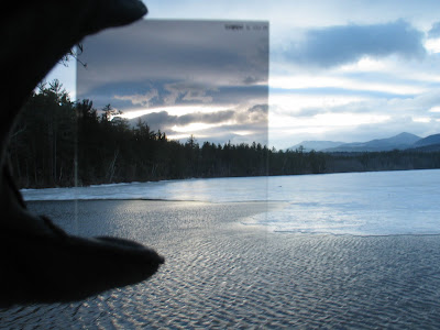
One important pointer: I suggest using your backslash key (\) to toggle a red mask on an off as you experiment with the clicking and dragging part. Don't despair if your gradient is going the wrong way at first or if it doesn't cover the exact part of the image that you want. I almost never get it right the first time. That's what "undo" is for. In fact, do it wrong on purpose and look at the red mask to see what's happening (don't forget to toggle to your regular view). Here's what mine looks like:
 So you can see that the red indicates where I am masking out the darker curves adjustment. You can also see that the masking is gradual, as opposed to just brushing the effect into one section in a clean line. In the adjustment layer mask it looks like this:
 Once you like your gradient, you can use your brush tool (B) at varying opacity to be even more precise. It's very easy and you will be pleased with the results.
 As shot, it's really not bad, but I swear that sky was more dramatic and darker than what my camera captured.
 After I fake the effect of a graduated neutral density filter the sky looks more like what I actually saw.
Voilà! Fake GND.
1. rich sunset, but completely dark river
2. lighter river, but way too bright sky
3. a "just OK" compromise that doesn't really capture what you saw
If you want to be old school about it, you would compensate up front by attaching a graduated neutral density filter to your camera. A GND filter adds a neutral gradient that basically slows down the exposure (by letting less light in) on part of your shot—typically the sky:
 But if you don't have a filter handy when you take the shot (and most of us don't), there is still hope. To do a post-processing version of a neutral density filter, you will need to understand the basics of masking (which I covered in a monthly special way back when). You may also want to review the very easy principles of masking in/out layer adjustments that I showed you in "Layer adjustments for the lazy artsy slob." I will only explain in shorthand here, because those other posts will help you with the basics.
In a nutshell, to mimic a GND filter you simply want to do a simple curves adjustment (just like showed you in "Layer adjustments for the lazy artsy slob") and instead of painting the effect in or out with a brush, you will use a gradient. (note: Do not confuse this with HDR although it has some similarities.)
So you start with a curves layer, and to darken things up, you pull the curve down and to the right:
Then you hit "G" to get your gradient tool (make sure you use the gradient and not the paint bucket from the same menu)...and up in the toolbar where you see the gradient settings, make sure you have the one selected (it's default anyway) that looks like a basic light-to-dark gradient...and finally, you just click in the image (make sure the mask of the curves adjustment layer is active!) and drag to create a gradient fill.One important pointer: I suggest using your backslash key (\) to toggle a red mask on an off as you experiment with the clicking and dragging part. Don't despair if your gradient is going the wrong way at first or if it doesn't cover the exact part of the image that you want. I almost never get it right the first time. That's what "undo" is for. In fact, do it wrong on purpose and look at the red mask to see what's happening (don't forget to toggle to your regular view). Here's what mine looks like:
So you can see that the red indicates where I am masking out the darker curves adjustment. You can also see that the masking is gradual, as opposed to just brushing the effect into one section in a clean line. In the adjustment layer mask it looks like this:Once you like your gradient, you can use your brush tool (B) at varying opacity to be even more precise. It's very easy and you will be pleased with the results.As shot, it's really not bad, but I swear that sky was more dramatic and darker than what my camera captured.After I fake the effect of a graduated neutral density filter the sky looks more like what I actually saw.Voilà! Fake GND.
On my iPhone: Darkness app
 I use the Darkness app whenever I have an outdoor shoot. It's a great reference to know exactly what time the sun rises and sets. You've heard of the "golden hour"—that hour after sunrise and before sunset? I usually schedule portrait shoots during the golden hour, so I like being able to look up the exact time for perfect lighting while I'm on the phone with a client. When I was in Paris, I used the app every day to make sure I was at the right spot at the right time. Yes, I know there is also a "golden hour" app that costs twice as much and includes "a database of over 50,000 carefully selected locations from every country in the world," but for me, that's overkill. I prefer to find my own locations, and unfortunately, I only regularly visit a couple of countries.
I know I sound like an ad, but I really do use this app all the time. I have my faves— Orem (that's Utah, folks), New York, London, and Paris—all lined up on one page. With my bad attitude about the short winter days (sunset at 5 p.m. is just plain wrong!), I can at least be grateful that I get exactly 1 hour and 7 minutes longer before sundown here than I would in London. I'm sure the Londoners are just dying with envy.
Thursday, December 2, 2010
December Monthly Special: 30 Days of Night
 From my "State Street" Utah project
Too dark? Not very seasonal?
What about "It came upon a midnight clear," O holy night," Silent night" ? Not that you have to photograph a nativity scene to participate in the monthly special (but you could).
Since I try to do themes each month that will push me (and hopefully inspire you) to try new things or to work on neglected projects, I decided that "night" will help me appreciate the darkness that comes all too early.
Posts I anticipate doing include:
- something on Brassaï
- night seen in black and white
- night seen in color
- Christmas lights photos
- tips for getting decent photos at night without pro equipment
- other non-night topics such as real-life retouch, photos in a real person's home, etc.
Friday, November 26, 2010
Two square books sitting on my coffee table right now
I'm sitting here in the "man cave," smack dab in the middle of my gray leather couch, feet up on my cold concrete coffee table, glowing apple logo reflecting off the black screen of my beloved 50-inch HDTV. Black, because instead of watching a movie, I have been reading the photo books that are enjoying their position of prominence on the coffee table.
Less than two years ago, the basement was nearly empty. The walls were painted a contractor-bulk-discount shade of white, and the durable red shag carpet was a convincing argument for built-in obsolescence.
Then came the flood.
It turns out that if your refrigerator installer buys the cheapest plastic hose for your ice-maker (as opposed to the pricey $12 variety), the thing might just burst in the middle of the night and do the Water Wiggle dance of doom—another homage to the 70s when you think about it. But you don't. And while your family and dog take refuge in a Residence Inn for a week to avoid injury and/or hearing loss from the 13 industrial fans running day and night, you don't yet realize that the ice-maker incident was in fact a baptism that would wash away the shag-a-delic past and lead to peace.
Granted, a minimalist gray monochrome is not everyone's idea of heaven, but for me it's the perfect backdrop for movies and photography.
Now, wasn't I going to talk about two square books on my coffee table? What's with the background, you ask? Well, two reasons. OK, no, three.
1. This blog is the closest I get to a journal, so I may as well document things.
2. There's a strange irony going on here (in the incorrect use of the word, which may as well be the correct use if you ask me)
3. It's just how my mind works.
I've already dealt with 1 and 3, so let me get to the books before I get to 2.
I have two shelves of nothing but photography books down here. All alphabetized. It's the closest I get to clutter in the man cave. I like to change out the books on the coffee table every few weeks, so right now I'm featuring two masters of square composition:
1. William Eggleston, 2 1/4
2. Anthony Hernandez, Waiting for Los Angeles
You can see pages from both Eggleston's and Hernandez's books through the "Booktease" feature at Photo-Eye Bookstore. What you will see is an inspiring collection of the mundane. The cover of Waiting for Los Angeles is one of several stunning images of tile in very utilitarian public spaces. In the introduction, Alain Sekula admires the "shimmering post-impressionist airiness and warmth" of the 27x27 square ceramic grid. "If we are reminded of the jumpy rhythms of Mondrian, it is Mondrian pushed back toward Seurat, and thus toward landscape, drowsy eyelashes diffracting bright summer light." The skeptic's valid reaction: Such poetic excess for tile! And besides, it's not as if Hernandez laid the tile himself. But of course, most photographers (or at least most of my favorite photographers) point at something and frame it. Their creative contribution is to make us stop and look.
On purely aesthetic grounds, not every photo in Waiting for Los Angeles has the appeal of the cover. As a whole, however, the book sheds light on waiting and on the spaces of waiting. As Sekula suggests, we start to realize that some people spend more time waiting than others. Waiting has its own politics.
The Eggleston book has equally stunning images of old signs, cars, shops, cafes, telephone lines, plastic flowers, radiators—more scenes of the ordinary that have to be seen to to be, well, seen, I guess. These are the types of photos that inspire me to appreciate my surroundings, however uninspired they may seem.
And now for the irony:
Both books take us back a few decades—back to an aesthetic we might associate with the 70s. Many of the buildings have since been renovated or destroyed. Sekula notes that a 2002 trip to the spot of the tile mosaic was fruitless. The colorful grid was nowhere to be found. "It turned out to have been completely covered with a thick layer of glossy battleship-grey enamel anti-graffiti paint." Luckily, I can look at the tile in the serenity of the man cave, where all signs of the 70s are contained within a couple of beautiful square books on my gray coffee table in my gray room. If I'm lucky, I might take some great photos of 70s-era relics. Perhaps something to hang on my dark gray walls.
Less than two years ago, the basement was nearly empty. The walls were painted a contractor-bulk-discount shade of white, and the durable red shag carpet was a convincing argument for built-in obsolescence.
Then came the flood.
It turns out that if your refrigerator installer buys the cheapest plastic hose for your ice-maker (as opposed to the pricey $12 variety), the thing might just burst in the middle of the night and do the Water Wiggle dance of doom—another homage to the 70s when you think about it. But you don't. And while your family and dog take refuge in a Residence Inn for a week to avoid injury and/or hearing loss from the 13 industrial fans running day and night, you don't yet realize that the ice-maker incident was in fact a baptism that would wash away the shag-a-delic past and lead to peace.
Granted, a minimalist gray monochrome is not everyone's idea of heaven, but for me it's the perfect backdrop for movies and photography.
Now, wasn't I going to talk about two square books on my coffee table? What's with the background, you ask? Well, two reasons. OK, no, three.
1. This blog is the closest I get to a journal, so I may as well document things.
2. There's a strange irony going on here (in the incorrect use of the word, which may as well be the correct use if you ask me)
3. It's just how my mind works.
I've already dealt with 1 and 3, so let me get to the books before I get to 2.
I have two shelves of nothing but photography books down here. All alphabetized. It's the closest I get to clutter in the man cave. I like to change out the books on the coffee table every few weeks, so right now I'm featuring two masters of square composition:
1. William Eggleston, 2 1/4

2. Anthony Hernandez, Waiting for Los Angeles

You can see pages from both Eggleston's and Hernandez's books through the "Booktease" feature at Photo-Eye Bookstore. What you will see is an inspiring collection of the mundane. The cover of Waiting for Los Angeles is one of several stunning images of tile in very utilitarian public spaces. In the introduction, Alain Sekula admires the "shimmering post-impressionist airiness and warmth" of the 27x27 square ceramic grid. "If we are reminded of the jumpy rhythms of Mondrian, it is Mondrian pushed back toward Seurat, and thus toward landscape, drowsy eyelashes diffracting bright summer light." The skeptic's valid reaction: Such poetic excess for tile! And besides, it's not as if Hernandez laid the tile himself. But of course, most photographers (or at least most of my favorite photographers) point at something and frame it. Their creative contribution is to make us stop and look.
On purely aesthetic grounds, not every photo in Waiting for Los Angeles has the appeal of the cover. As a whole, however, the book sheds light on waiting and on the spaces of waiting. As Sekula suggests, we start to realize that some people spend more time waiting than others. Waiting has its own politics.
The Eggleston book has equally stunning images of old signs, cars, shops, cafes, telephone lines, plastic flowers, radiators—more scenes of the ordinary that have to be seen to to be, well, seen, I guess. These are the types of photos that inspire me to appreciate my surroundings, however uninspired they may seem.
And now for the irony:
Both books take us back a few decades—back to an aesthetic we might associate with the 70s. Many of the buildings have since been renovated or destroyed. Sekula notes that a 2002 trip to the spot of the tile mosaic was fruitless. The colorful grid was nowhere to be found. "It turned out to have been completely covered with a thick layer of glossy battleship-grey enamel anti-graffiti paint." Luckily, I can look at the tile in the serenity of the man cave, where all signs of the 70s are contained within a couple of beautiful square books on my gray coffee table in my gray room. If I'm lucky, I might take some great photos of 70s-era relics. Perhaps something to hang on my dark gray walls.
Thursday, November 18, 2010
A Buffalo Plaid photo project in Photoshop

Buffalo plaid—that large check design, usually in two colors (red and black being the classic)—appeared sometime mid-19th century based on my "vast" research of eHow and "xmarksthescot" ("A community of kiltwearers"). But if you were alive in the 1980s, you've probably seen as much as any lumberjack. As I'm sure you are well aware, the great recycling mill of fashion resurrected the trend a few years ago and it is still going strong.
Personally, I wasn't a huge fan of lumberjack style back in the 80s (maybe it's because I grew up in Oregon?), so I'm certainly not about to start wearing it now. But since it's "squares" month, I decided to invent a buffalo plaid-inspired photo project. It's fun, you can do any number of variations, and it's a good way to play around with blending modes. I will attempt to give a tutorial that's short enough to let me relax tonight but clear enough for you to follow. [note to self from the next morning—that is clearly not possible]
Going into it, I had no idea what photos I would use. I ended up doing a typographic collage from photos of signage mostly around the seedy Paris Pigalle neighborhood, best known for the Moulin Rouge. Here's what I did. No need to copy, just take the principles and do what you want with it.
step 1. Create a new document.
I decided that since buffalo plaid is big, my photo should be big as well. I set my document size to 20x20 inches at 300 dpi.

step 2. Set your grid preferences.
Under the Photoshop menu bar, go to Preferences--Guides, Grids, and Slices. The default setting (at least on mine) was one gridline every inch with four subdivisions. Because I wanted to work with big squares, I changed the setting to one gridline every four inches with four subdivisions. This makes more sense once you see the grid on your document. Go to View-->Show-->Grid or use Command-H (Mac) Ctrl-H (PC) to toggle between viewing the grid and not. One more setting that will make your life easier. View-->Snap to-->Grid will help you drag images around and have them align with the grid more easily.

step 3. Time to prep your plaid.
Traditionally, you would have a color (here, the classic lumberjack red), black, and then a blend of that color and black. I just did a search for "buffalo plaid" and then pulled up an image to make sure I got the pattern right.
You will create your pattern in 3 layers, one for each color. I started on the background layer with the grid view turned on, then I used the rectangular marquee tool (M) to select the soon-to-be-bright-red squares. NOTE: Hold down shift key as you click-and-drag to make square selections. More importantly, keep holding down shift key as you make each new square until you have selected everything you need for that layer. Once you see that "dancing ants" around your square selections, just hit Command-J (PC: Ctrl-J) to turn those selections into a new layer.
 Hard to tell from this screen capture, but the "dancing ants" are showing my checkerboard selection.
  When I hit command-J, my new layer looks like this (the white part was what I had selected and the rest is blank).
 Note that in the layers palette I have turned off the background so you can see the checkerboard. Once you have made your 3 separate checkered layers, you will want to leave the background off for good.
Now, repeat the process (remember to start from the background layer each time) with the soon-to-be-black squares. Then repeat for the soon-to-be-reddish-black squares. At this point, you should just turn off the background layer and never turn it back on, not even when you flatten the image at the end. If all three of your squares layers are visible, you will see nothing but white. If you make only one layer visible, you will see white for that layer's squares only.
step 4. Color your plaid.
This part is easy. Select your color and then use the paint bucket tool to color the squares for the appropriate layer. I did bright red, black, and then a mixture of the two. HINT: If, like me, you are unsure what exact color would be the right mix, just create a layer of black, a layer of red (or whatever you want), then lower the opacity to 50% on the top layer to see the mixed version. Use the eyedropper tool (I) to sample the color, and you've got it. Then just trash the two color experiment layers. Or just eyeball it. Who cares?
 Here I am, happily clicking with the paintbucket tool to color one of the checked layers. If I hadn't yet deselected (i.e. still had dancing ants) then one click would have sufficed. Oh well.
That's a lot for one step, I know. This is where you need to decide what photos to use. Pictures of friends? Places you like? Related objects? It's up to you.
When you have a photo open, you can do one of two things:
1. figure out the exact dimensions of each square (mine would be 4x4 inches at 300 dpi) and use the crop tool to select the area you will then copy and paste into your project
OR
2. use the same marquee tool selection process (I keep the grid on to help) to cut out squares. When a square is selected, just copy it and then paste (same as you would in a Word document) into your grid document. With this method, you may end up have to use "transform" to adjust the size.
 Here is a photo. I just pasted above my reddish black check layer. See how it covers up the check? That's because its layer is above the check layer—for now. When I'm all done, I will drag the check layer back up above its corresponding pictures.
When you paste it, it will appear on its own layer. Name the layer, because you will end up with a lot of them. In fact, I highly recommend working on one color (i.e. all the bright red checks) at a time with the other layers turned off to avoid confusion. You will also want to put the photo layers above their respective check layers so they don't get hidden under the color for now. When you have populated one check layer with photos, you can select all of those layers along with its corresponding check layer, and then group them (from the pull-down menu top-right of the layers palette) into a tidy folder.


Step 6. Tidy up before the big finish.
At this point, I am assuming you have a whole bunch of layers: your three check layers and then one layer for each photo square. Hopefully, you have put each group into its own folder. Now, take the check layer in each group and pull it to the top of its photos (in other words, it's going to cover up the photos with its color).


So now, all of your photos are hiding behind their respective layers of checked color and you are ready for the final stage...
Step 7. Experiment with layer blending modes and opacity until you have the right blend.
Take this one checked layer at a time. With a checked layer selected, change your layer blending mode (in the layers palette, it will say "normal" but you want...who knows?) until you like what you see. I ended up using "Hue" on the black check layer...
 See how it says "Hue" in the pull-down menu just below the Layers tab?
Finally, to fine tune, I adjusted the opacity of the photos (usually to about 40%) to tone down the intensity of the black and reddish black layers. And voilà!
The end result doesn't fit my décor, but it makes a really cool desktop wallpaper on my new computer.
 Kind of cool that it manages to fit a 3x5 grid of wallpaper on my screen.
If you want to try it out on yours, download it from my new "freebies" gallery (I'll add free photos when I'm feeling extra generous). Just go to the gallery. NOTE: Click to view it in its massive original size (or else you will only be downloading the size you are viewing) and then right-click to save the file.
Tuesday, November 16, 2010
Paris Photo for those of us not in Paris

Last year, I was in Paris for the Paris Photo show. This year, I'm definitely not in Paris. For those of us not able to visit in person, you can look at an online gallery of more than 370 images from the show. Click on one of the thumbnails and then click the arrow that will appear towards the top right side to scroll through. For more realism, pretend that the room is filled with pretentious gallery workers grinding their teeth as they begrudgingly pander to nouveau riche patrons.
Last year, I did two posts about displaying photos based on ideas from Paris Photo. Read part 1 and part 2 for some inspiration (including more square frames!). I just took a second look at the posts and realized how much I had already forgotten.
Friday, November 12, 2010
Squares Monthly Special photo by Fritsch
 © Hochzeitsturm, Darmstadt 2010 by Fritsch
Just to encourage you to do the monthly special and then share it, I wanted to show you what Fritsch of Hobokollektiv did. I did an interview with Fritsch in 2009, showcasing some of his great work.
I'm working on revamping the organization of my site (perhaps during the holidays?), but until then, if you post a "squares" monthly special on your own blog of photo sharing website and then paste the link into a comment of any post during the month (or email it to me), I'll add it to the link of the monthly special post so other readers can see it.
Tuesday, November 9, 2010
Square composition: album cover inspiration
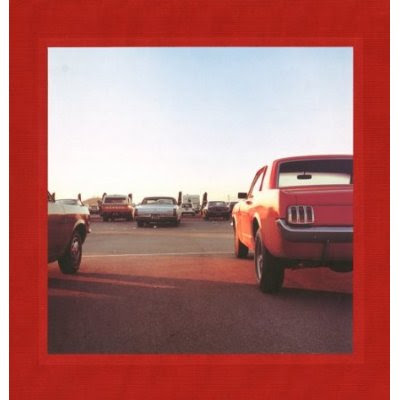
Album covers can be a great source of inspiration for composing square photos. I have used them before to show how strong diagonal lines create powerful images. Here, I want to do a quick and basic look at a few ways to slice a square:
1. the pyramid
 This goes back to the strong diagonal lines method. Think of creating a pyramid or triangle with the square and you've got an eye-catching shape.
2. The diagonal slice
 This is basically a variation on the triangle (note the triangle made by her arms). The difference between the pyramid and the diagonal slice (I'm totally making up these terms, btw) is that the former occupies the center and the latter cuts the square into two triangles with one diagonal line. In the Belle & Sebastian cover, you can imagine a line extending from the upper right corner (her head) down through her arm toward the lower left corner. The other "triangle" provides space for text, but the photo would be equally well balanced without it.
3. Dead center
 A strong composition for a portrait is to place the subject dead center in the square. The eyeline is typically in the top third of the square. In the above image, the nose is pretty much dead center.
4. The horizontal split

Hiroshi Sugimoto's beautiful seascape was used for a U2 album cover. You may be used to seeing photos that give the sky either 1/3 or 2/3 of the visual space, but in a square format, a 50-50 division creates a yin/yang sense of balance.
5. The vertical split
 Same as above, but sliced vertically. Here, the boy is the line dividing the two halves.
6. Four quarters
 You may be noticing by now that square composition like symmetry. In the Weezer cover, you get four even slices of the square topped off with a third of white space.
 Same 4 quarters structure in the famous Beatles album cover, but in this case, the people occupy the lower half of the image.
Pay attention to square composition, divide it into shapes in your mind, and you will develop an eye for visually appealing crops.
1. the pyramid
This goes back to the strong diagonal lines method. Think of creating a pyramid or triangle with the square and you've got an eye-catching shape.2. The diagonal slice
This is basically a variation on the triangle (note the triangle made by her arms). The difference between the pyramid and the diagonal slice (I'm totally making up these terms, btw) is that the former occupies the center and the latter cuts the square into two triangles with one diagonal line. In the Belle & Sebastian cover, you can imagine a line extending from the upper right corner (her head) down through her arm toward the lower left corner. The other "triangle" provides space for text, but the photo would be equally well balanced without it.3. Dead center
A strong composition for a portrait is to place the subject dead center in the square. The eyeline is typically in the top third of the square. In the above image, the nose is pretty much dead center.4. The horizontal split
Hiroshi Sugimoto's beautiful seascape was used for a U2 album cover. You may be used to seeing photos that give the sky either 1/3 or 2/3 of the visual space, but in a square format, a 50-50 division creates a yin/yang sense of balance.
5. The vertical split
Same as above, but sliced vertically. Here, the boy is the line dividing the two halves.6. Four quarters
You may be noticing by now that square composition like symmetry. In the Weezer cover, you get four even slices of the square topped off with a third of white space.Same 4 quarters structure in the famous Beatles album cover, but in this case, the people occupy the lower half of the image.Pay attention to square composition, divide it into shapes in your mind, and you will develop an eye for visually appealing crops.
Friday, November 5, 2010
Displaying photos: The square photo grid
 Serendipitously, just after posting my monthly special on squares, I found out that one of the members of a movie group I attend has a display of square-framed photos in his home. I asked if he wouldn't mind sharing them on my blog and he graciously accepted. I have done posts in the past about gallery displays, but this is my first post about photos in another person's home. Of the two, I much prefer the context of real life. In fact, I may just have to make this a regular feature.
I'll let Scott tell you about the photos:
These are all photos I originally took with my Olympus OM-2, mostly on Kodachrome, and then digitized and converted to monochrome for the wall installation. Each has significant family value, either because they are shot in places where ancestors originated or lived, or because they are places Judy and I have been to together. I wavered back and forth about whether to crop the photos themselves square or not, and decided in the end to keep them all landscape (because most are landscapes, or because I'd need to eliminate key family history elements in the cropping). I did not restrict myself to set ratios, as you will notice, in order to add a bit of randomness to what was a fairly ordered arrangement.

Here is a brief background of each photo, numbering 1-9, left-to-right and top-to-bottom:
Thanks, Scott for sharing your inspiring use of photography in the home!
1. Sandbar at low tide off the western shore of the Isle of Man. My Manx ancestors' graves are in a cemetery immediately to the left of the photo, on top of a steep, sandy cliff that erodes away in the winter storms each year, contributing more and more ancestral bits to the sandbar...
2. Veteran's club, Castronovo, Sicily. My wife's maternal family immigrated from this village in the 1920s and settled in New Jersey. The old men in the village gather at these clubs during the day to play cards, talk and drink.
3. Sunset over the Cousenon River near Mont St. Michel. Judy and I camped along this river on our first trip to France. This is where it has been made into a straight canal, in man's never-ending fight to control nature ("le couesnon en sa folie mit le Mont en Normandie").
4. Fence bordering St. John's Church, central Cardiff, Wales. Just to the right and inside the fence lies the tombstone of my 4th-Great Grandmother, Ann John, who is buried with her son. Her husband and other children joined the LDS church and emigrated to Utah in the 1850s.
5. Puri for sale on the train platform in Agra, India. Judy and I spent a day exploring the town of the Taj Mahal, and while we were waiting for the return train to New Delhi this man pushed his cart with steaming hot bread up and down in the afternoon light.
6. Almond orchards in bloom, Kashmir, India. Judy and I saw this scene from a taxi early one afternoon while we were on a carpet-buying excursion. The workers are taking a break after gathering up branches pruned that day.
7. Italian fishermen setting off for the evening in their boat along the coast of the Adriatic, near Ancona. We camped there one night, on our way north to Venice after visiting distant relatives of Judy's father's family in Foggia, Puglia.
8. Deer Creek Reservoir, looking west, during a lull in a thunderstorm. I was driving back from Park City one evening and caught this very interesting study in gray.
9. Minamijima Island, Ogasawara (Bonin) archipelago, Japan. This limestone island 500+ miles south of Tokyo has a natural arch through which the ocean flows. We took a study abroad group there, and Judy is wading in the shallow, warm water.
Subscribe to:
Posts (Atom)


